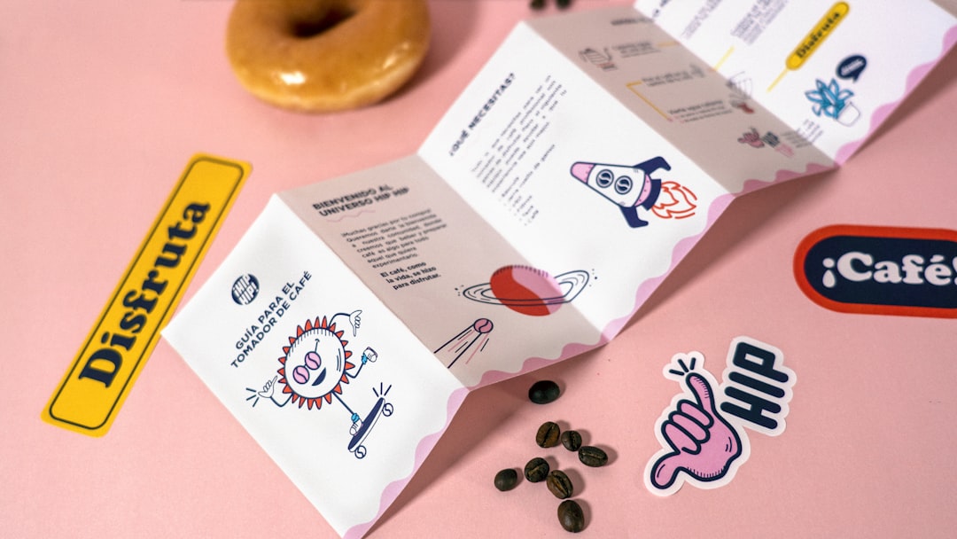
Color is one of the most powerful tools in a designer's arsenal. When creating a brand identity, the colors you choose aren't just aesthetic decisions—they're psychological triggers that can influence customer perception, emotional response, and purchasing behavior. Understanding color psychology is essential for creating brand identities that resonate with your target audience and communicate your brand values effectively.
Understanding Color Psychology Fundamentals
Color psychology is the study of how colors affect human behavior, emotions, and decision-making. Research has consistently shown that color can increase brand recognition by up to 80%, and that 85% of consumers cite color as a primary reason for purchasing a particular product. These statistics underscore the critical importance of strategic color selection in brand identity design.
Different colors evoke different emotional responses across cultures, though some associations are nearly universal. Warm colors like red, orange, and yellow tend to create feelings of energy, excitement, and warmth, while cool colors like blue, green, and purple often evoke calmness, trust, and sophistication. Understanding these fundamental associations is the first step in making informed color choices for your brand.
The Meaning Behind Popular Brand Colors
Red: Perhaps the most powerful color in the spectrum, red commands attention and evokes strong emotions. It's associated with passion, excitement, energy, and urgency. Brands like Coca-Cola, Netflix, and Target use red to create a sense of excitement and stimulate appetite or action. Red increases heart rate and creates a sense of urgency, making it effective for clearance sales and call-to-action buttons.
Blue: The most universally liked color, blue conveys trust, reliability, security, and professionalism. It's no coincidence that financial institutions, technology companies, and healthcare providers frequently choose blue for their branding. Facebook, IBM, and American Express all leverage blue's trustworthy associations. Studies show that blue can actually lower heart rate and create feelings of calm and stability.
Green: Associated with nature, health, growth, and sustainability, green has become increasingly popular as environmental consciousness grows. Brands like Whole Foods, Starbucks, and John Deere use green to communicate natural, healthy, or environmentally-friendly values. Green also represents prosperity and is often used in financial contexts.
Yellow: Optimistic, cheerful, and attention-grabbing, yellow stimulates mental activity and generates energy. McDonald's and IKEA use yellow to create feelings of happiness and affordability. However, yellow must be used carefully—too much can cause anxiety or strain the eyes, and it's often associated with caution or warning signs.
Orange: Combining red's energy with yellow's friendliness, orange is enthusiastic, creative, and inviting. It's less aggressive than red but still creates a sense of urgency and excitement. Brands like Nickelodeon, Amazon, and Fanta use orange to appear friendly, confident, and fun. Orange is particularly effective for calls to action.
Purple: Historically associated with royalty, luxury, and sophistication, purple also conveys creativity and wisdom. Brands like Hallmark, Yahoo, and Cadbury use purple to communicate quality, imagination, or premium positioning. Purple is relatively rare in nature, which can make it stand out and feel special or exclusive.
Black: Sophisticated, powerful, and elegant, black communicates luxury, exclusivity, and timelessness. High-end brands like Chanel, Nike, and Apple use black to convey premium quality and modern sophistication. Black provides excellent contrast and readability, making it a popular choice for text and minimalist designs.
White: Representing purity, simplicity, cleanliness, and minimalism, white creates a sense of space and modernity. Tech companies and healthcare brands often use white to communicate innovation, cleanliness, or simplicity. White space (negative space) is also crucial in design, helping other colors stand out and improving readability.
Cultural Considerations in Color Selection
While some color associations are nearly universal, cultural context significantly influences color perception. A color that communicates trust and stability in one culture might represent something entirely different in another. For example, white is associated with purity and weddings in Western cultures but represents mourning and death in many Asian cultures. Red symbolizes luck and prosperity in China but can indicate danger or debt in Western contexts.
If your brand operates internationally or targets diverse audiences, researching cultural color associations is essential. What works perfectly for a local market might completely miss the mark—or worse, offend—in another cultural context. Global brands often adapt their color schemes for different markets or choose colors with positive associations across multiple cultures.
Creating Effective Color Palettes
While choosing a primary brand color is important, creating a complete color palette involves selecting complementary colors that work together harmoniously. Most brand identities include a primary color (the dominant brand color), secondary colors (supporting colors that complement the primary), and accent colors (used sparingly for emphasis or calls to action).
The 60-30-10 rule is a useful guideline: use your primary color for 60% of the design, secondary colors for 30%, and accent colors for 10%. This creates visual balance while maintaining brand consistency. Your color palette should include enough variety to create visual interest without becoming chaotic or confusing.
Consider accessibility when building your color palette. Ensure sufficient contrast between text and background colors for readability, particularly for users with visual impairments. The Web Content Accessibility Guidelines (WCAG) provide specific contrast ratio requirements that should inform your color choices, especially for digital applications.
Color Combinations and Harmony
Understanding basic color theory helps create harmonious palettes that are visually pleasing. Complementary colors (opposite on the color wheel) create vibrant, high-contrast combinations perfect for grabbing attention. Analogous colors (adjacent on the color wheel) create harmonious, cohesive schemes that are easy on the eyes. Triadic color schemes (three colors evenly spaced on the color wheel) offer balanced, vibrant options with good contrast.
Monochromatic schemes use variations of a single color (different shades, tints, and tones) to create sophisticated, cohesive designs. This approach is particularly effective for minimalist or luxury brands. Whatever combination you choose, test it across different applications—print materials, digital screens, signage—to ensure consistency and effectiveness across all touchpoints.
Industry-Specific Color Strategies
Different industries tend to favor certain colors based on the emotions and associations they want to evoke. Financial services often use blue and green to communicate trust, stability, and growth. Healthcare and wellness brands frequently choose blue, green, or white to convey cleanliness, health, and trustworthiness. Food and beverage companies often use red, yellow, and orange to stimulate appetite and create feelings of warmth and comfort.
Technology companies tend toward blue, black, or white for their modern, innovative, and trustworthy associations. Luxury brands frequently employ black, gold, or purple to communicate exclusivity and premium quality. While these industry trends exist, breaking them can help your brand stand out—if done strategically and with clear reasoning behind the choice.
Testing and Refining Your Color Choices
Before committing to a brand color palette, test it with your target audience. Conduct surveys, focus groups, or A/B tests to gauge reactions and associations. Ask questions about how the colors make people feel, what qualities they associate with the brand, and whether the colors align with your brand values and positioning.
Create mockups of your brand identity applied to various materials—business cards, websites, packaging, signage—to see how the colors work in different contexts. Colors can appear different on screen versus print, and what works at large scale might not work at small scale. This testing phase can reveal issues before you've invested in full production.
Practical Applications: Bringing Color Psychology to Life
Once you've chosen your brand colors, consistency is key. Create brand guidelines that specify exact color values (CMYK for print, RGB for digital, Pantone for specialty printing) to ensure consistency across all applications. Document how colors should be used, including proportion guidelines, acceptable color combinations, and what to avoid.
Consider how your colors will appear in different contexts. Your website background might be white for readability, but your social media graphics might use your primary brand color as the background. Your logo might appear in full color on your website but need a simplified single-color version for certain print applications. Plan for these variations in advance.
Remember that color trends evolve over time. While you shouldn't chase every trend, being aware of contemporary color preferences can keep your brand feeling current and relevant. Pantone's Color of the Year and design trend reports can provide insights, but any changes should align with your brand strategy rather than following trends blindly.
Conclusion: The Strategic Power of Color
Color is far more than a superficial design choice—it's a strategic tool that can significantly impact brand perception, customer behavior, and business success. By understanding color psychology principles, considering cultural context, creating harmonious palettes, and testing your choices with real audiences, you can develop a brand identity that not only looks beautiful but also communicates effectively and resonates emotionally with your target market.
Whether you're creating a new brand identity from scratch or refreshing an existing one, thoughtful color selection grounded in psychological principles and strategic thinking will help your brand stand out, connect with customers, and communicate your unique value proposition. The colors you choose become an integral part of your brand story—make sure they're telling the right one.
Ready to Create a Powerful Brand Identity?
Our expert design team can help you develop a brand identity with strategically chosen colors that resonate with your target audience and communicate your brand values effectively.
Start Your Brand Journey