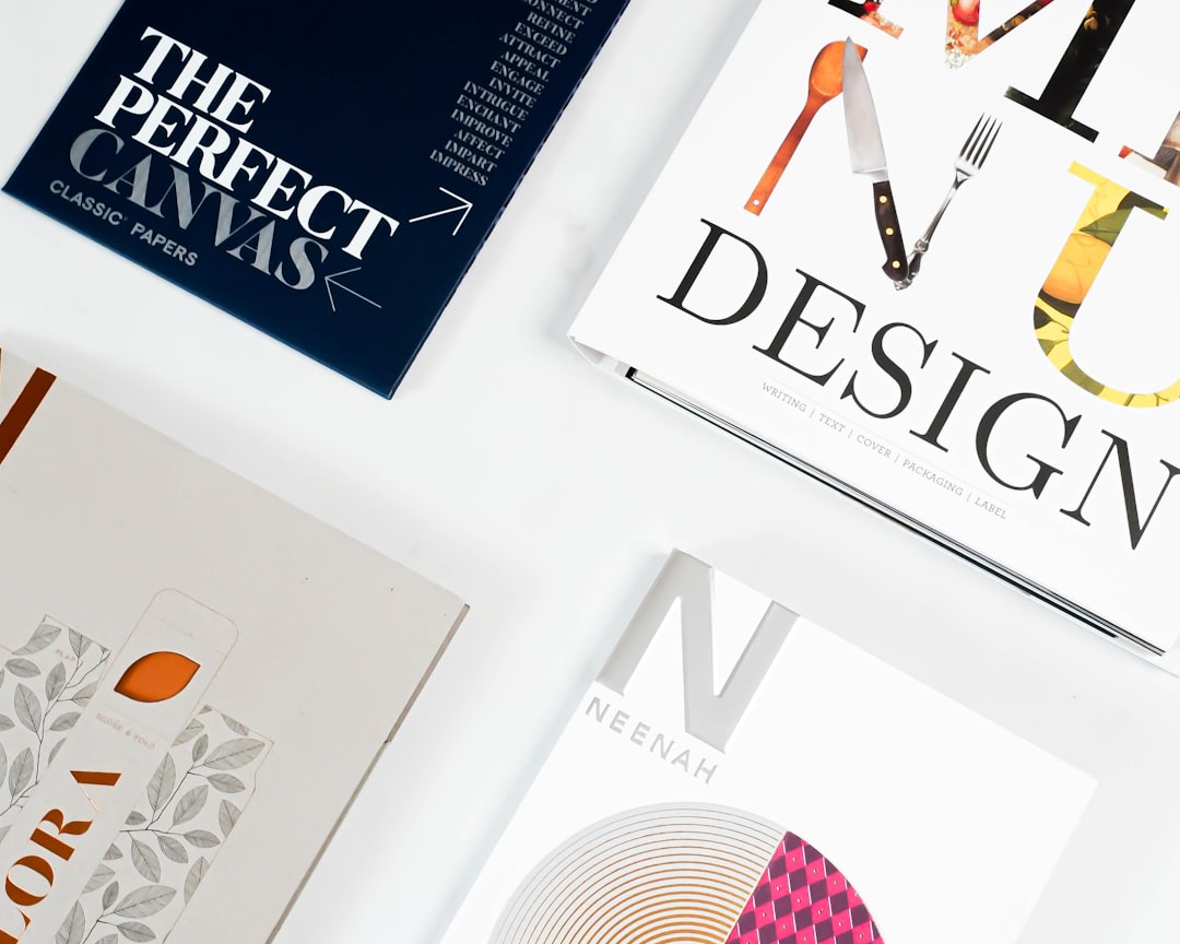
In an age of digital saturation, printed posters remain one of the most effective ways to capture attention and communicate messages in physical spaces. Whether promoting an event, advertising a product, or raising awareness for a cause, a well-designed poster can stop people in their tracks and compel them to engage. However, creating truly eye-catching posters requires more than just placing text and images on a page—it demands understanding of visual communication principles, strategic design thinking, and mastery of technical execution. This guide explores modern poster design principles that consistently produce compelling, effective results.
Understanding the Purpose and Context of Your Poster
Before touching design software, clearly define your poster's purpose and context. What specific action do you want viewers to take? Are you promoting an event, selling a product, raising awareness, or providing information? Each purpose requires different design approaches. Event posters need clear date, time, and location information prominently displayed. Product advertising posters should showcase benefits and create desire. Awareness posters must communicate their message quickly and memorably.
Consider where your poster will be displayed and how people will encounter it. Will it hang on a community bulletin board among dozens of other posters? Will it appear in a subway station where people glance briefly while rushing past? Will it be displayed in a retail environment where customers can study it up close? The viewing context dramatically influences design decisions. Posters viewed from a distance need larger text and simpler compositions, while those examined up close can include more detailed information and intricate design elements.
Understanding your audience is equally critical. Who are you trying to reach, and what appeals to them? A poster for a punk rock concert should look dramatically different from one promoting a classical music recital, even though both are event posters. Consider demographic factors like age, interests, cultural background, and aesthetic preferences when making design choices. The most technically perfect poster fails if it doesn't resonate with its intended audience.
Establishing Strong Visual Hierarchy
Visual hierarchy guides viewers through your poster in a logical order, ensuring they see the most important information first and understand the message quickly. In poster design, people typically have only seconds to capture attention and communicate—effective hierarchy makes those seconds count. Establish hierarchy through size, color, contrast, position, and spacing to direct the eye naturally through the design.
Start with a clear focal point—the single most important element that should grab attention first. This might be a striking image, a bold headline, or an eye-catching graphic. Make this element significantly larger or more visually prominent than other elements. From there, create a clear path through secondary and tertiary information. For event posters, the typical hierarchy might be: eye-catching image or headline first, event name second, date and time third, venue and additional details fourth.
Use the "squint test" to check your hierarchy: squint at your design until details blur. Can you still identify the most important elements? If everything blends together or the wrong elements stand out, adjust sizes, contrast, or positioning. Effective hierarchy feels natural and intuitive—viewers shouldn't have to work to find important information. Every element should have a clear purpose and position in the hierarchy; if something doesn't support the message, remove it.
Typography as a Design Element
Typography is often the most important element of poster design. Text communicates the literal message while also contributing to the visual aesthetic and emotional tone. Choose typefaces that align with your message and audience. Modern sans-serif fonts convey contemporary, clean professionalism. Classic serif fonts suggest tradition, reliability, and sophistication. Display fonts (decorative or stylized typefaces) create personality and impact but should be used sparingly and only when legible.
Limit yourself to two or three typefaces maximum—typically one for headlines and one for body text, with possibly a third for emphasis or special elements. Too many different fonts create visual chaos and appear unprofessional. Establish clear size distinctions between different text levels: headlines should be significantly larger than subheadings, which should be larger than body text. This size variation creates hierarchy and improves scanability.
Consider legibility above all else. No matter how clever or beautiful your typography, if viewers can't read it quickly, your poster fails. Ensure sufficient contrast between text and background colors. Avoid placing text over busy or multicolored backgrounds without using techniques like solid color boxes, shadows, or overlays to improve readability. Test your poster at actual size and viewing distance to confirm text is legible. Minimum recommended font sizes vary by viewing distance: for posters viewed from 3-5 feet away, use at least 14-18 points for body text and 36+ points for headlines.
Color Theory and Emotional Impact
Color choices dramatically affect how your poster is perceived and remembered. Colors evoke emotional responses and cultural associations that influence viewer reactions. Warm colors (reds, oranges, yellows) create energy, excitement, and urgency. Cool colors (blues, greens, purples) convey calmness, trust, and professionalism. Understanding these associations helps you choose colors that support your message rather than contradict it.
Create visual impact through strategic color use rather than using every color available. Limited color palettes often prove more effective than rainbow assortments. Many powerful posters use just two or three colors plus neutrals. Consider complementary colors (opposite on the color wheel) for vibrant, attention-grabbing combinations, or analogous colors (adjacent on the color wheel) for harmonious, sophisticated schemes. Monochromatic palettes using variations of a single color create unity and elegance.
Ensure sufficient contrast for readability and visual impact. High contrast between foreground and background elements makes designs pop and improves legibility. Black text on white background provides maximum contrast and readability, though colored combinations can be equally effective if contrast is maintained. Use color strategically to highlight important information or create focal points. A single element in a bright, contrasting color naturally draws the eye in a more subdued composition.
Composition and Layout Strategies
Strong composition creates balance, guides the eye, and makes designs visually appealing. The rule of thirds—dividing your design into a 3×3 grid and placing important elements at intersections—creates dynamic, interesting layouts. Center alignment creates formal, stable compositions suitable for traditional or elegant designs. Asymmetrical layouts feel modern and dynamic, creating visual interest through intentional imbalance.
Use grids to organize elements and create structure. Even when final designs appear organic or free-flowing, they're typically built on underlying grid systems that provide invisible structure. Grids help align elements, maintain consistent spacing, and create professional-looking layouts. Most design software includes grid and guide features to facilitate this structured approach.
White space (negative space) is not wasted space—it's a crucial design element that prevents clutter, creates focus, and improves comprehension. Generous margins frame your content and prevent cramped, overwhelming designs. Space between elements helps viewers process information in digestible chunks rather than feeling overwhelmed. Don't feel compelled to fill every inch of your poster; sometimes less is more. Strategic emptiness makes the filled areas more impactful.
Imagery and Visual Elements
Images are powerful communication tools that can convey complex ideas instantly and evoke emotional responses. Choose images strategically to support your message, not just decorate the space. High-quality photography creates professionalism and realism. Illustrations allow for creative interpretation and can communicate abstract concepts. Graphics and icons simplify information and create modern, clean aesthetics.
Ensure images are high resolution (300 DPI for print) at their final size. Pixelated or blurry images instantly undermine professionalism and credibility. Consider image treatment: full-color photos create realism and vibrancy; black and white photography conveys sophistication, drama, or timelessness; duotone or limited color treatments create stylized, contemporary looks; silhouettes and cutouts provide flexibility and focus attention on subjects.
Be mindful of how text interacts with images. Placing text directly over complex or multicolored images often reduces readability. Solutions include using solid color blocks behind text, applying gradient or color overlays to images to create more uniform backgrounds, choosing image areas with relatively uniform color or value for text placement, or using large, bold typography that maintains legibility over images.
Creating Memorable Visual Concepts
The most effective posters communicate through clear visual concepts rather than just attractive arrangements of elements. A strong concept is an idea that can be understood quickly and remembered long after viewing. This might be a clever visual metaphor, an unexpected juxtaposition, a play on words visualized graphically, or a striking image that encapsulates your message.
Brainstorm concepts before jumping into design execution. List keywords associated with your message, explore metaphors and analogies, consider what emotions you want to evoke, and research how others have approached similar topics. Sometimes the most effective concepts are surprisingly simple—a single powerful image and a few words can communicate more effectively than complex, busy designs.
Test concepts with others before committing to full design. Show rough sketches or mockups to people unfamiliar with your project. Can they understand the message without explanation? Does the concept resonate emotionally? Is it memorable? Honest feedback at the concept stage saves time and leads to stronger final designs. Don't fall so in love with your initial idea that you miss opportunities for improvement.
Technical Considerations for Print Production
Even the most beautiful design fails if not executed properly for print. Work at high resolution (300 DPI minimum) from the start. Create designs in CMYK color mode rather than RGB to ensure colors print as expected. Include bleed areas (typically 0.125 inches beyond trim size) for any elements that extend to the edge. Keep important content within safety margins (at least 0.25 inches from edges) to account for cutting variations.
Choose appropriate paper stocks and finishes for your poster. Glossy finishes make colors vibrant and images shine, ideal for photographic posters and retail applications. Matte finishes provide sophisticated, glare-free viewing for art posters or office environments. Uncoated stocks offer natural, tactile appeal perfect for organic or handcrafted aesthetics. Consider durability needs: outdoor posters require weather-resistant materials, while indoor posters offer more options.
Understand standard poster sizes and design accordingly. Common sizes include 11×17 inches, 18×24 inches, 24×36 inches, and 27×40 inches (movie poster standard). Designing to standard sizes reduces costs and ensures compatibility with standard frames and displays. If custom sizes are necessary, discuss feasibility and costs with your printer before finalizing designs. Communicate clearly with print providers about specifications, materials, quantities, and deadlines to avoid surprises.
Design Trends vs. Timeless Principles
Design trends come and go—minimalism, maximalism, retro styles, gradient backgrounds, geometric patterns, hand-drawn elements, and countless others have their moments in the spotlight. Being aware of current trends can help your designs feel contemporary and relevant, particularly for time-sensitive applications like event promotion. However, chasing trends without strategic purpose can result in designs that quickly feel dated.
Balance trend awareness with timeless design principles. Clear hierarchy, strong typography, appropriate color usage, and effective composition never go out of style. Consider your poster's intended lifespan when deciding how much to embrace trends. Event posters promoting something happening next week can safely use very current styles. Posters representing ongoing services or long-term campaigns benefit from more timeless approaches that won't feel outdated quickly.
The most effective approach often blends contemporary aesthetics with solid foundational principles. Your poster should feel current and relevant without being a slave to trends. Study historical poster design—from vintage travel posters to revolutionary propaganda to concert posters—to understand what makes certain designs endure. Often, it's bold simplicity, clear concepts, and strong execution of fundamental principles rather than trendy techniques.
Testing and Refinement
Great poster design rarely happens in a single iteration. Build in time for testing and refinement. Print your design at actual size to evaluate it at scale—details that look fine on screen might be too small or get lost when printed. View it from expected distances: if your poster will hang on a wall viewed from 10 feet away, evaluate it from that distance. Can you read key information? Does the focal point grab attention? Is the hierarchy clear?
Show your design to others, ideally people who represent your target audience. Ask specific questions: What catches your attention first? What message do you take away? What emotions does it evoke? Can you find the date/time/location? Would this make you interested in attending/purchasing/learning more? Be open to feedback and willing to make changes. Sometimes small adjustments—moving an element, changing a color, increasing font size—dramatically improve effectiveness.
Review technical specifications carefully before printing. Check color accuracy, resolution, bleed, and text safety. Proofread all text multiple times—typos on printed posters are embarrassing and expensive. If your budget allows, request a printed proof from your printer to verify quality before running the full quantity. This extra step can catch issues and ensure you get exactly what you expect.
Conclusion: The Art and Science of Poster Design
Creating effective posters combines artistic creativity with strategic communication and technical execution. The most successful posters grab attention quickly, communicate clearly, evoke appropriate emotions, and inspire action. They achieve this through thoughtful application of design principles: strong visual hierarchy, effective typography, strategic color usage, compelling composition, and clear conceptual thinking.
Whether you're designing concert posters, product advertisements, event promotions, or awareness campaigns, these principles provide a foundation for creating impactful work. Remember that poster design is purpose-driven: every choice should support your communication goal. By understanding your audience, clarifying your message, applying sound design principles, and executing with technical precision, you can create posters that don't just decorate walls—they capture attention, communicate effectively, and inspire action. In a world full of visual noise, well-designed posters still have the power to stop people in their tracks and make them pay attention.
Ready to Create Stunning Posters?
Our design team specializes in creating eye-catching posters that grab attention and deliver results. From concept to printing, we'll bring your vision to life.
Start Your Project